


Why Does Thermal Imaging Need So Many Colors?

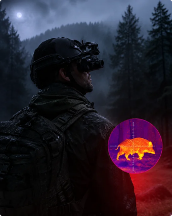

The first time you look at a thermal imaging product specification, you might come across something like this:
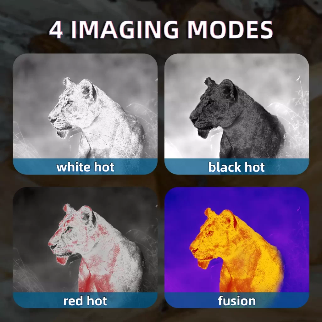
Black Hot / White Hot / Red Hot / Fusion
And, honestly, the first reaction can be:
Why does a thermal imaging device need so many colors?
At first glance, it almost feels like choosing a filter on your phone.
Black and white? Sure.
Red? Okay.
Fusion? Now we're getting fancy.
But these aren't Instagram filters for making a thermal image look cooler.
They serve a much more practical purpose: helping people understand thermal information more easily.
And that raises a surprisingly interesting question.
If a thermal imaging device is detecting heat, why doesn't it just show us the temperature and call it a day?
Well, because human eyes don't naturally see thermal radiation.
The device sees the heat information first. Then it has to turn that information into something we can actually read.
That's where all those colors come in.
First, What Is a Thermal Imager Actually Seeing?
A regular camera works with visible light.
Light enters the lens, reaches the sensor, and eventually becomes the image you see on the screen.
Thermal imaging works differently.
Instead of relying on visible light, a thermal imaging device detects infrared radiation and differences in thermal energy between objects and their surroundings.
In other words, the sensor isn't thinking:
“That object is red.”
It's thinking more like:
“This area is warmer than that area.”
The raw information is about thermal differences.
But people aren't particularly good at looking at a collection of thermal data and immediately understanding what it means.
So the device converts those differences into an image.
And suddenly, instead of seeing a bunch of invisible infrared information, we get something our eyes can interpret:
black, white, gray, red, yellow, and other colors.
That's the real reason thermal imaging has different color modes.
They're different ways of presenting the same kind of thermal information.
White Hot: The Classic Black-and-White Approach
Let's start with one of the most familiar options:
White Hot.
The basic idea is simple.
Warmer areas are displayed as brighter tones, while cooler areas appear darker.
So the image moves roughly through:
black → gray → white
It sounds almost too simple.
But that's part of the appeal.
A grayscale image can make thermal differences relatively easy to read without introducing a lot of additional colors into the picture.
Think of it like turning a normal photo into black and white.
Suddenly, you're paying less attention to the original colors and more attention to brightness, contrast, and shape.
There's also one important thing to remember:
If a hot area appears white on the screen, that doesn't mean the object is actually white.
The color is simply a visual representation of its thermal information.
In thermal imaging, white is a display choice, not the object's actual color.
Black Hot: Same Information, Different Direction
Then we have:
Black Hot.
If White Hot makes warmer areas brighter, Black Hot essentially reverses the presentation.
Warmer areas appear darker, while cooler areas appear lighter.
At this point, you might reasonably ask:
“So... isn't that just White Hot backwards?”
Pretty much.
And that's exactly why it can be useful.
Sometimes a particular scene simply feels easier to interpret when the warmer areas appear darker rather than brighter.
It's less about one mode being technically “better” and more about how people perceive and interpret the image.
You might prefer White Hot.
Someone else might prefer Black Hot.
Neither one changes the thermal information being detected by the sensor.
They simply present that information differently.
It's a little like changing between light mode and dark mode on an app.
The information is still there.
You just might find one version easier to look at.
Red Hot: When the Heat Gets Some Attention
Then things get a little more colorful.
Enter:
Red Hot.
Compared with the two grayscale modes, Red Hot uses color to make thermal differences more visually noticeable.
And yes, it certainly looks more dramatic.
But the point isn't to make the image prettier.
Color can help draw attention to areas with stronger thermal differences and give the viewer another way to interpret the scene.
Think about the difference between saying:
“Look at the brightest area.”
and saying:
“Look at that area over there.”
Sometimes color simply makes the second instruction easier.
That's one of the useful ideas behind color palettes in thermal imaging.
They don't create new thermal information.
They change how that information is visually presented.
White Hot may give you a straightforward grayscale image.
Red Hot may make certain thermal differences stand out more immediately.
Different presentation, same basic principle:
turn invisible thermal information into something people can understand.
Fusion: Why Make the Image Even More Colorful?
And then there's:
Fusion.
Compared with Black Hot and White Hot, Fusion can look much more complicated.
There are more colors, more visual transitions, and more layers to the image.
So why not just keep things simple?
Because thermal scenes can contain a lot of subtle temperature differences.
When everything is represented through a simple grayscale scale, some differences may be less visually obvious.
A more varied color palette can provide additional visual levels, helping the viewer distinguish between different areas of thermal information.
The important thing here is not:
More colors = better product.
That's an easy assumption to make, but it's not really how thermal imaging works.
A more useful way to think about it is:
More visual levels can provide another way to interpret thermal differences.
And whether that is useful depends on the scene, the application, and the person looking at the screen.
So... Which Color Mode Is the Best?
This is probably the question that comes next.
White Hot or Black Hot?
Red Hot or Fusion?
If you're comparing products, you might even be tempted to count the number of available color modes.
Four modes must be better than two, right?
Not necessarily.
There isn't one universal “best” color mode for every thermal imaging application.
Different users may find different presentations easier to interpret.
One person may prefer the straightforward contrast of White Hot.
Another may find Black Hot more comfortable.
Someone else may like the visual emphasis of Red Hot.
And another user may prefer the richer transitions offered by Fusion.
So instead of asking:
“Which color mode is the best?”
A more useful question is:
“Which display mode makes the information easiest for my users to understand?”
That's a much more interesting question, especially if you're sourcing thermal imaging products for a specific market.
Color Mode Is Part of Product Design
This is something that can be easy to overlook when you're reading a specification sheet.
When you're sourcing a thermal imaging device, you might naturally focus on things like:
- Sensor resolution
- Pixel size
- Detection range
- Field of view
- Magnification
- Frame rate
- Display resolution
And, of course, those specifications matter.
But the way all that information eventually appears on the screen matters too.
A thermal imaging device isn't just a sensor.
It's a complete user experience.
The sensor collects the thermal information.
The optics determine how that information is captured.
Image processing helps turn it into a usable image.
And the display presents that image to the person actually using the device.
So when you see Black Hot, White Hot, Red Hot, and Fusion in a specification sheet, it isn't just a list of decorative options.
It's also a small indication of how much flexibility the product gives users in interpreting thermal information.
For B2B buyers, this is where the conversation becomes more interesting.
Instead of simply asking:
“Does this product have four color modes?”
You can ask:
“What does each mode help the end user see more easily?”
That's a much better way to evaluate a feature.
A Quick Look at BTI10
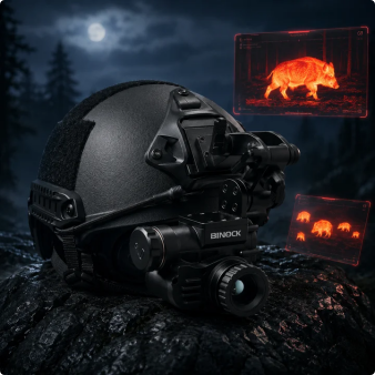
Take BINOCK's BTI10 as an example.
The device provides four image modes:
White Hot, Black Hot, Red Hot, and Fusion.
On a specification sheet, that might look like just one more feature.
But in actual product design, those four modes give users different ways to view the same thermal scene.
And they work alongside the rest of the system, including:
- 384 × 288 resolution
- 12μm pixel size
- 16° × 11° field of view
- 1× / 2× / 4× / 8× magnification
- 50Hz frame rate
- 1024 × 768 HD OLED display
- Uncooled thermal sensor
None of these specifications should really be looked at in isolation.
A higher number in one category doesn't automatically tell you what the final viewing experience will be like.
The sensor, optics, image processing, display, and interface all work together.
The color palette is simply one part of that larger system.
Thermal Imaging Colors Aren't Really About Color
So, back to the original question:
Why does thermal imaging need so many colors?
Because thermal imaging isn't just about detecting heat.
It's also about communicating thermal information to a human being.
The sensor detects thermal differences.
The system turns those differences into an image.
And different color modes give users different ways to interpret that image.
So when you see:
Black Hot.
White Hot.
Red Hot.
Fusion.
Don't think of them as four filters competing to make the picture look better.
Think of them as four different ways of asking the same question:
“How can we make this thermal information easier to understand?”
Because in thermal imaging, color isn't really there to make the picture prettier.
It's there to make the information easier to read.
Share on Social:


- PREV: What Does “1000m Detection Range” Actually Mean?
- NEXT: Not NEXT
